Marina Branding
categoryBranding & Identity
durationPermanent
share
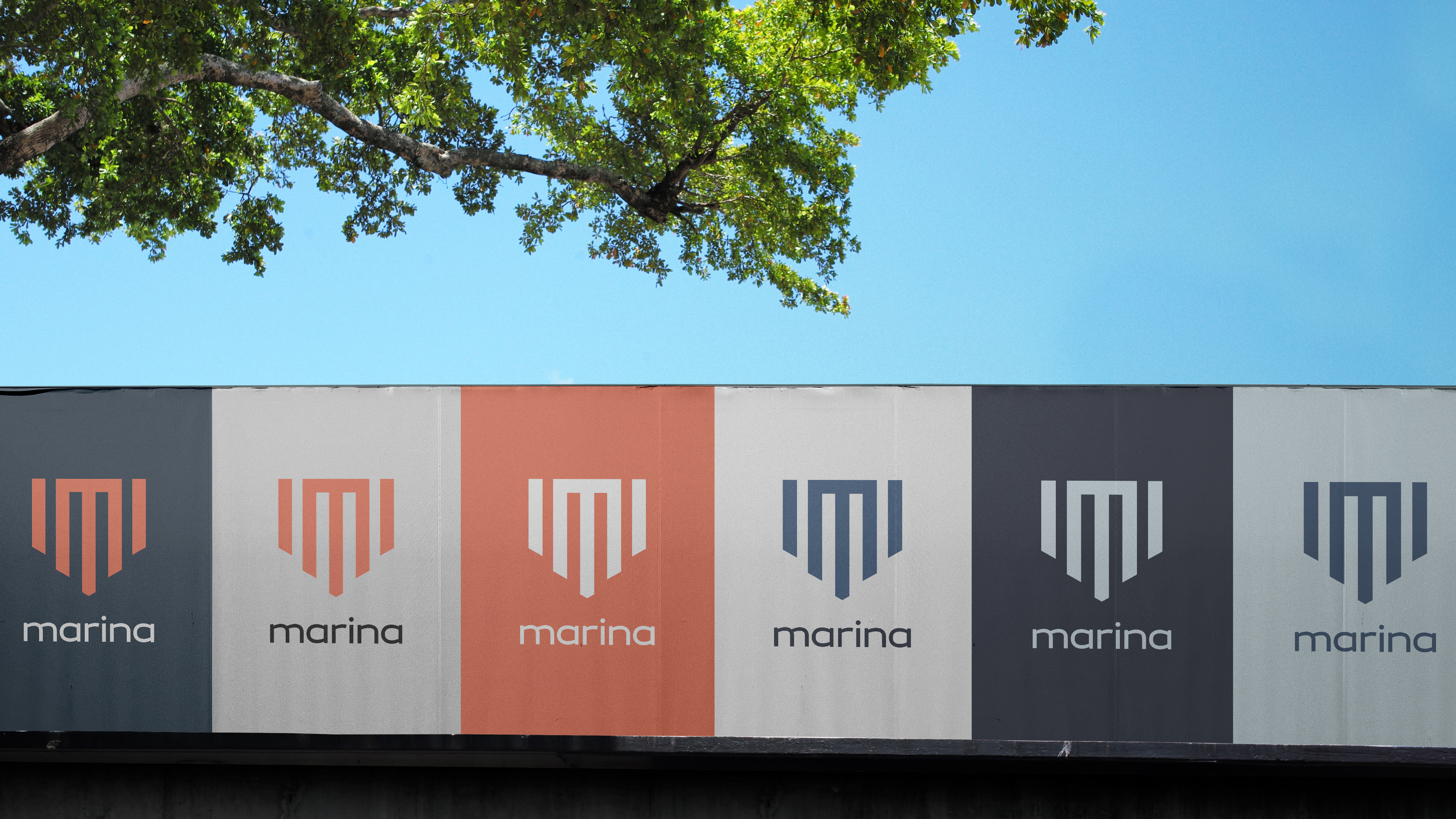
Marina’s visual identity shines in its simplicity and directness, besides the letter M representing Marina’s first letter “M”, the vertical lines are used to communicate superiority, strength, and the project’s ability to reach new heights, both figuratively and literally.
The font compliments it in its juxtaposition, instead of the hard lines with sharp edges we’ve used a soft elegant font to highlight the brand’s other important aspects: luxury and elegance.